Visualising quality details and carbon neutral living
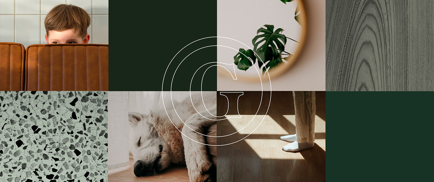
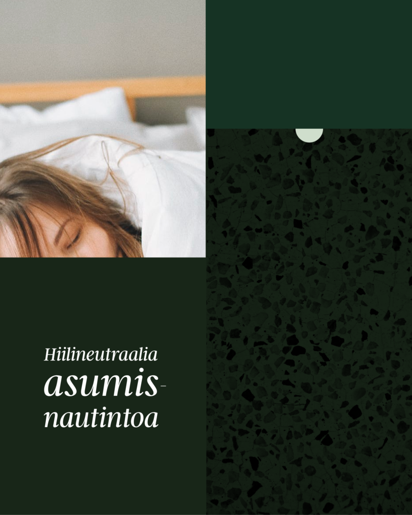
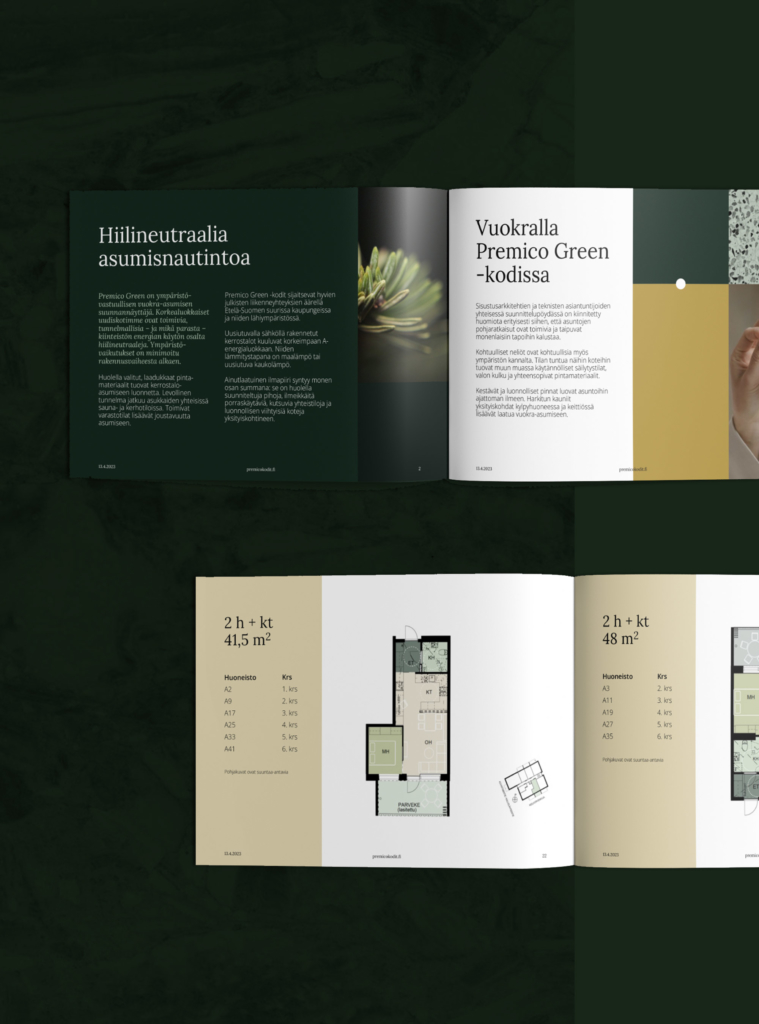
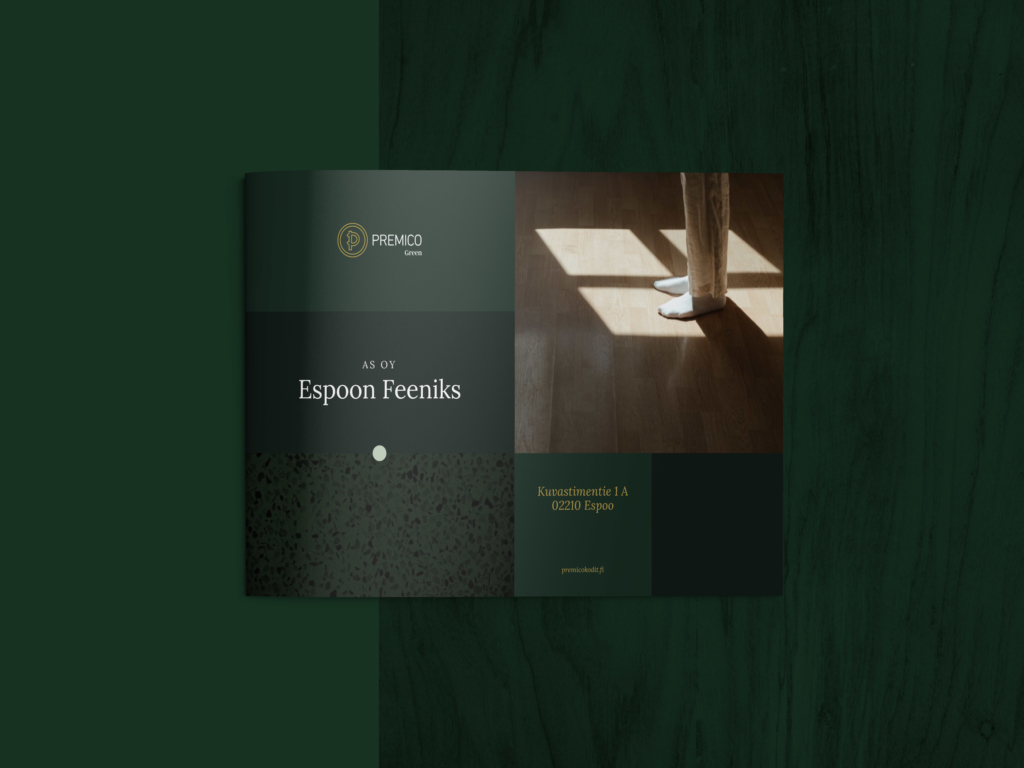
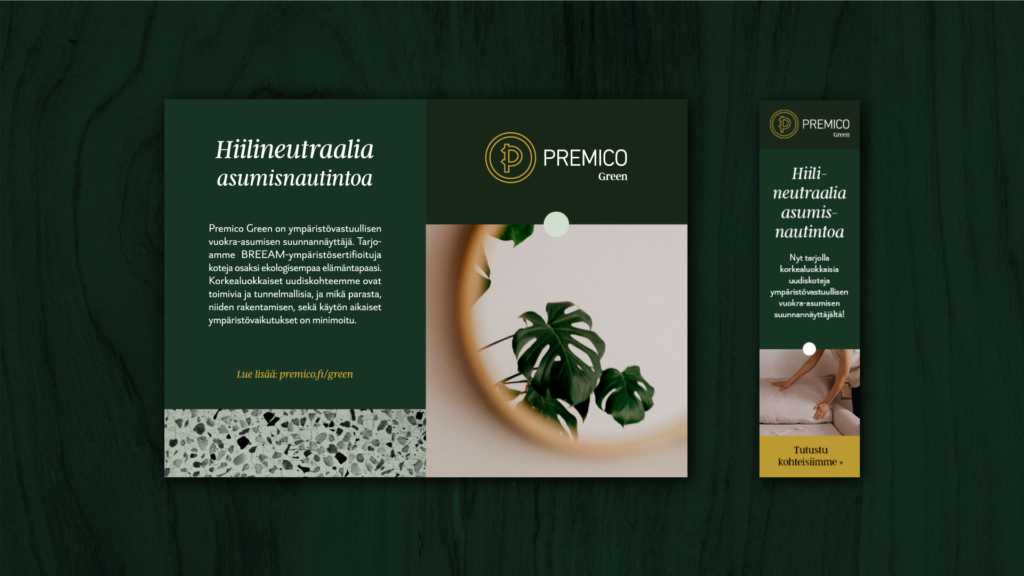
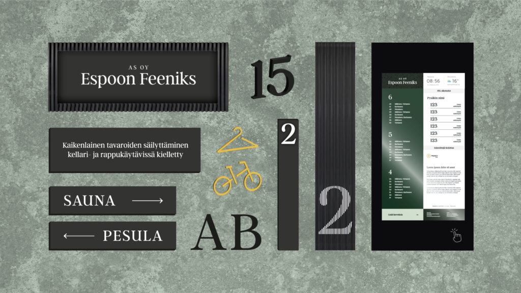
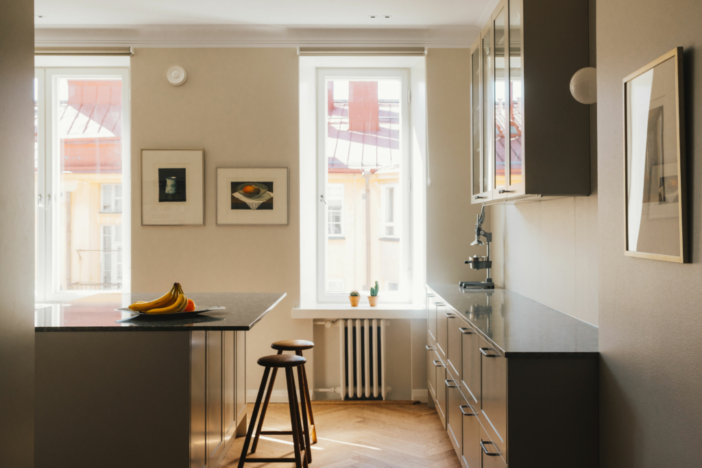
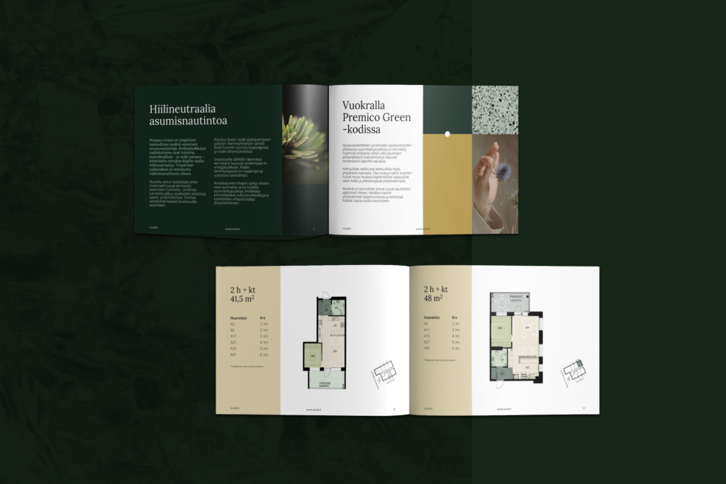
A dark yet cosy graphic identity celebrates the quality details of living. It is implemented in various graphic templates, marketing materials, and signage.
A solid message of quality and responsibility
The brand identity is built on a well-defined foundation: Quality of living goes hand in hand with sustainability, and attention to the tiniest details adds a premium feel. From brochures to multi-channel marketing materials and signage, the new brand serves various purposes.
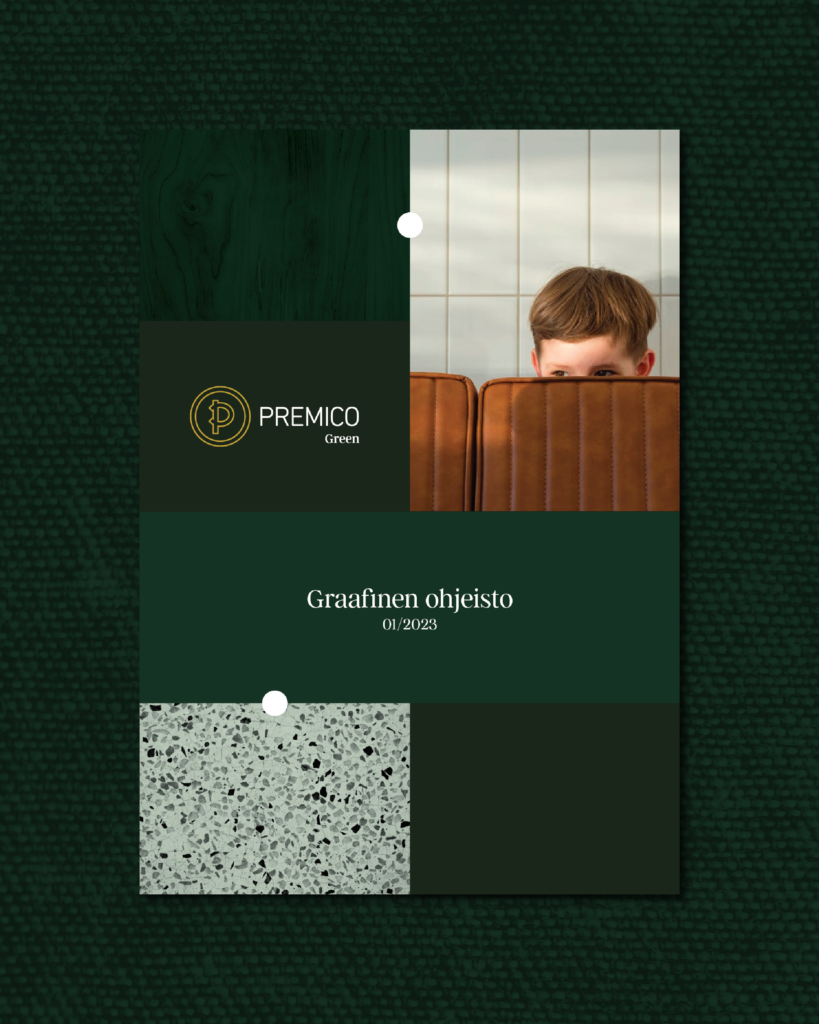
Visual language is dark and elegant, yet down-to-earth and approachable. New graphic guidelines define unified colours, layouts, and style for photography and graphic elements. Marketing texts are written to a tone of voice consistent with the brand. The existing logo and typography were integrated into the design.
Atmosphere is the sum of its parts
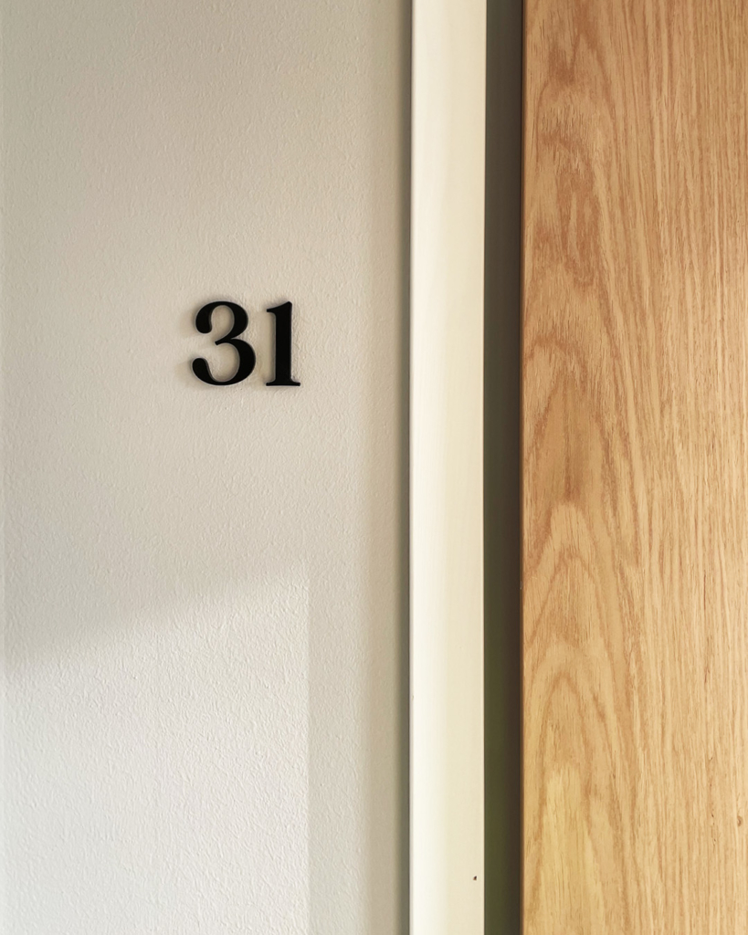
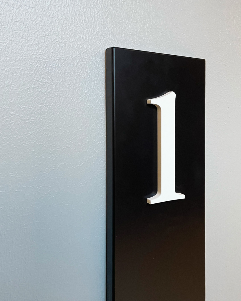
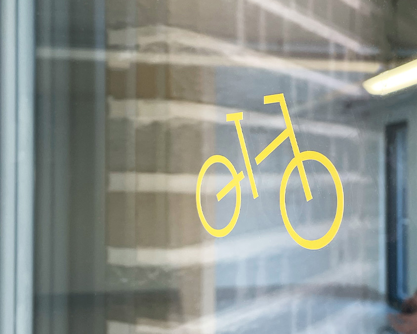
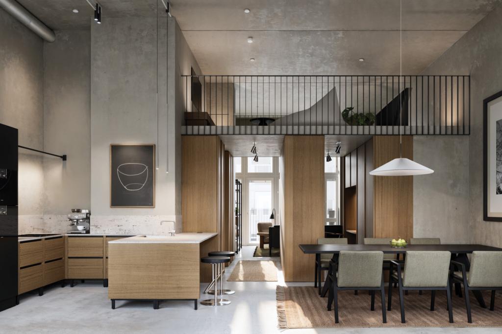
In the stairways and common spaces you can see a signage concept that ties two worlds together: it is based on our interior design concept and visual brand identity. The concept was piloted in the first Premico Green development project in Espoo.
